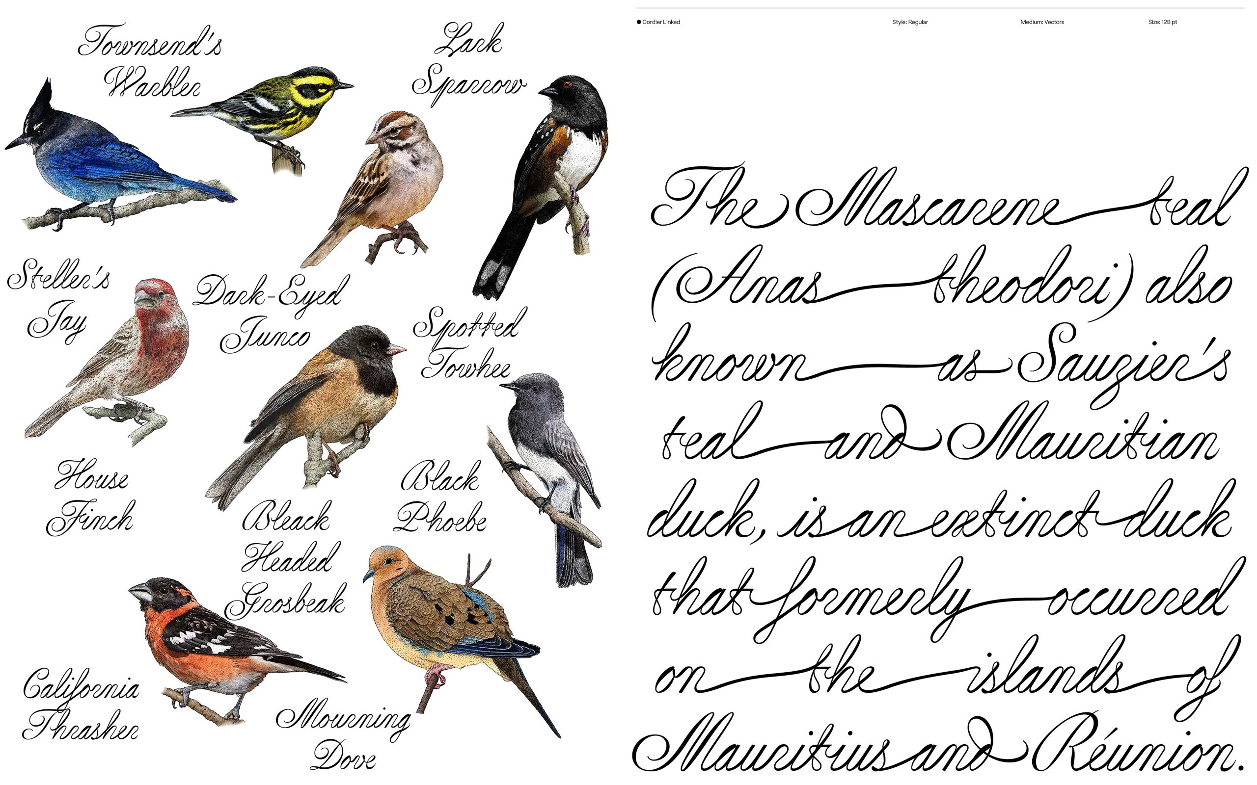
As script typefaces go, Sharp Type‘s Cordier Script hits all the right notes. It is serpentine, graceful, and rhythmic. The letterforms are not so tightly wound as to resemble an elementary school cursive primer — look at that gorgeous capital B! Its quirks give it space and an almost handwritten quality. Like the birds that grace its samples, Cordier Script flutters and dances on screen. It’s the handwriting I wish I had: elegant but a little left-of-center.
For the pleasure of the line, the pen no longer stops between words, and the whole sentence is formed in a single stroke. Benjamin Gomez
Designed by Benjamin Gomez, Cordier Script was inspired by the penmanship of Louis Barbedor, a 17th-century French calligrapher. Gomez drew the letterforms from the intricate plates of Barbedor’s 1650 book, Les écritures financière et italienne-bastarde, engraved by Pierre Cordier. The result feels uniquely of this moment and steeped in tradition.
Sample of Louis Barbedor’s caliigraphy, courtesy Benjamin Gomez
Cordier Script echoes Barbedor’s daring hand—its inverted thick-and-thin strokes sweep diagonally upward, each letter a study in acrobatic finesse. Sharp Type


