Key Ideas and Mood | Typography Trends: 2023 → 2025 → 2026
2023: The Era of Experimentation and Awareness
-
Key Ideas: Accessibility (fonts for neurodivergent readers), custom and variable fonts as a way to stand out, the return of retro nostalgia (80s, 90s).
-
Mood: The search for balance between “expressive” and “accessible.” A desire to stand out, but without losing readability. A return to the familiar as a reaction to instability.
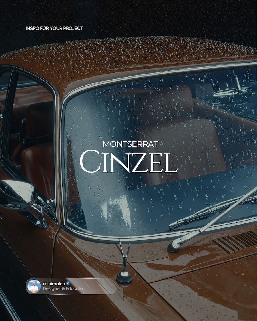
2025: “Old Money” and the Reconciliation of Opposites
-
Key Ideas: “Quiet luxury” (old money aesthetic) — elegant, restrained typefaces. Reconciliation of extremes: medieval ornament + digital discipline (GS Lomba), classic Didot + variability (Gando).
-
Mood: The search for timeless elegance. Design becomes more restrained, but technically complex. Warmth and humanity (Snowee) coexist with monumentality (Aegis).
2026: The Return to Tried-and-Tested Classics
-
Key Ideas: Total dominance of geometric grotesques and neo-grotesques. The list is predominantly “workhorses”: GT America, Graphik, Helvetica (inspired), Akkurat, Suisse Int‘l. These are fonts for systems, for interfaces, for big brands.
-
Mood: The search for stability and reliability. Instead of experiments, a reliance on proven, “functional” forms. The “quiet confidence” of 2025 transforms into the “systemic reliability” of 2026.
What Has Actually Changed?
-
From Individuality to System: In 2023, everyone was looking for a unique “custom” font. In 2026, designers choose superfamilies with 40, 80, 104 styles (like TT Norms Pro, GT America) that cover all of a brand’s needs at once.
-
From Experiment to Function: The experimental, “weird” fonts of 2023 have given way to perfectly honed, functional grotesques. Form follows function.
-
From “Wow” to “Reliable”: The emotional message has shifted from a desire to surprise to a desire to inspire trust. Brands (and their designers) need predictability and quality, not a sensation.
What Has Remained (or Returned)?
-
Grotesques were, are, and will be. But if in 2023 they were part of the overall picture, in 2026 they have become its unconditional center.
-
Variability (Variable Fonts). This trend from 2023 hasn’t just remained; it has become the standard. In 2026, no serious typeface family is without it.
-
Retro influence hasn’t gone anywhere, but its form has changed. Instead of direct 80s stylization (as in 2023), we see a reinterpretation of classic grotesques from the early and mid-20th century (Suisse Int’l, Söhne).
The Main Conclusion
The trend of 2026 is a conscious rejection of “trendiness” in favor of timeless functionality. Designers are tired of the endless race for novelty and are choosing fonts that will work for years. It is a return to the roots of modern design—clarity, order, and reliability—but enriched by technical capabilities (variability) and the experience of previous years.